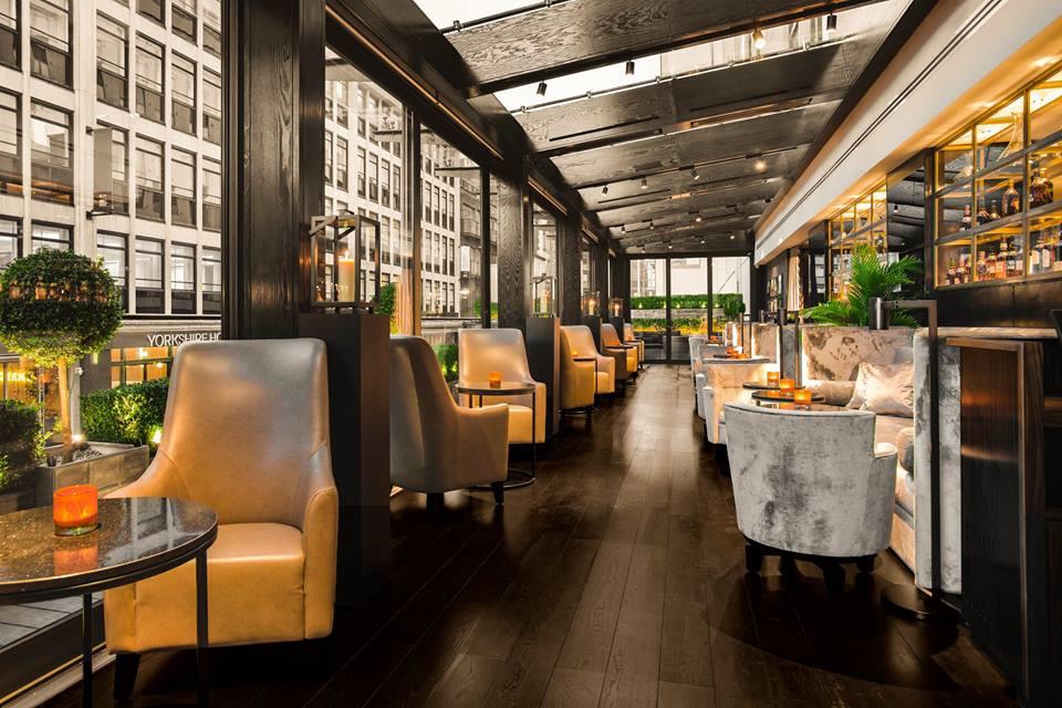
When designing your restaurant’s aesthetic, it’s vital to ensure that there’s cohesion between how your establishment looks and the type of food that it offers. Doing this helps to strengthen your brand image, promote positive guest response and engagement, and endorses a professional image of your eaterie. This will also increase your restaurant growth. We dig down into the details of each of these benefits and how to go about ensuring your menu and your overall design are deliciously in sync.

Culinary Cohesion
For your restaurant to be the best it can be, use both the decor and the menu to bring out the best in each other. Tie both into your establishment’s overall ethos or intended ambiance. For example, if your restaurant and its menu is all about seasonal and foraged produce that is locally sourced, then reflect this in the aesthetic of the dining spaces; think simple, rustic-style wooden restaurant chairs and tables; use lots of plants; consider commissioning a local craftsperson to design a couple of bespoke focus pieces of furniture like a sideboard or countertop.
Similarly, if your menu is cutting edge contemporary and experimental, you could consider using minimalist design throughout your restaurant, with perhaps a few quirky elements or unexpected light fittings: a single chandelier, for example, or the odd piece of taxidermy.
The aim of matching your menu to your overall design is to supercharge your guests’ experience and make it as memorable a one as possible.
Build Your Brand
Tying your aesthetic to your menu is a highly effective way to cement the strength of your brand; this is especially important if you are planning on opening restaurants in additional locations in the future.
To do this, think about incorporating the colors that are used in your establishment’s design in your menu, as well as any relevant motifs. For example, your interior walls are painted moss green and dove grey: use these colors predominantly in your menu’s design, too. If there is a distinctive element in the architecture of your building, take advantage of it: if there are trees growing on the grounds, use a simplified silhouette of a tree as a recurring image in your menu. If the structure features any special element, like a steeple, unusually shaped windows, or ivy growing abundantly up its walls, use this as a visual component in your menu.
Guest Reaction
Creating overall cohesion is very important in terms of the professionalism with which your guests will view your establishment. This can be very subtle: your diners may not consciously notice that your menu matches your restaurants’ design, but it will powerfully affect their perception of your business.
A menu that’s unified with the overarching aesthetic is a subtle indicator of your restaurant’s professional credentials, and your visitors are more likely to both view you positively and return to dine again if you use this simple technique.
Practical Considerations
The practical components of your eaterie’s personality need to be considered, too. For example, if your restaurant is focused on high turnover, then laminated options are probably your best bet in terms of durability. Similarly, think about the lighting design of your restaurant. If you’re going for an intimate, cozy vibe, with lots of little nooks and low lighting, you need to make sure that the font size and style of your menus are clearly legible in the conditions in which your guests will be reading them.
Think, too, about what would best suit your overall design and your target customer: are placemat style menus a better fit, or does a menu on a custom stand in the center of the table work better to create the aesthetic you’re aiming for? Going back to our seasonal, foraged produce establishment that we mentioned at the start, this kind of business may change the contents of its menu daily, depending on what food is available and what isn’t. In this case, then, menus that can be quickly printed on-site are the only practical option. So, here, attention could be paid to the overriding ethos by using recycled paper and menu holders made from sustainable materials.
Use Menu Descriptions Wisely
Matching your menus to your restaurant’s aesthetics includes thinking about the wording of your menu, too. If your establishment is working with a minimalist vibe, then keep things simple in your menu descriptions, too; if your eaterie’s focus is on fine dining, then allow the dish descriptions to be more evocative. Our seasonal, forage-friendly joint? Why not use the details of each meal to tell the story of the food’s provenance.
Match Made in Food Heaven
Ensuring that your restaurant’s menu is working in harmony with its overall design is a relatively easy way to boost your business’ image and subtly level up your guests’ experience. Take a look at your current menu, and consider how it could be tweaked to best reflect the unique ambiance of your eaterie. Think about its style, font, wording, and then give it a make-over to ensure that it truly reflects the beauty of your culinary vision and the aesthetic elements of the building that houses it.


